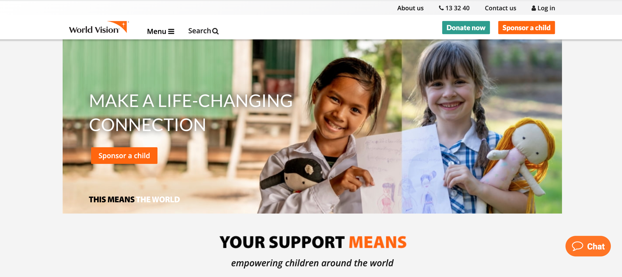
Background:
The 40 Hour Famine (40HF) is a fundraising event targeted at high school children to raise funds to help end child hunger. The existing 40HF website provided a poor user experience due to limited capabilities and a complex sign-up process.
Solution:
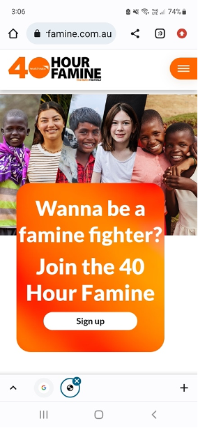
We created a new 40HF website and platform that was more appealing to the younger target audience. By making the whole online experience fun and easy to join, we hoped to increase participation and donations.
Implementation:
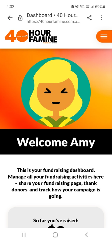
In writing, I used the concept of becoming a ‘famine fighter’ to encourage young people to be part of a community. Participants could choose their own avatars and share their fundraising page with others to gain donations.
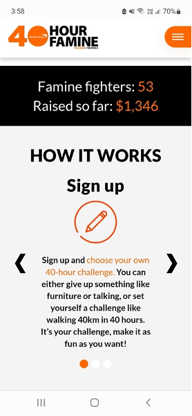
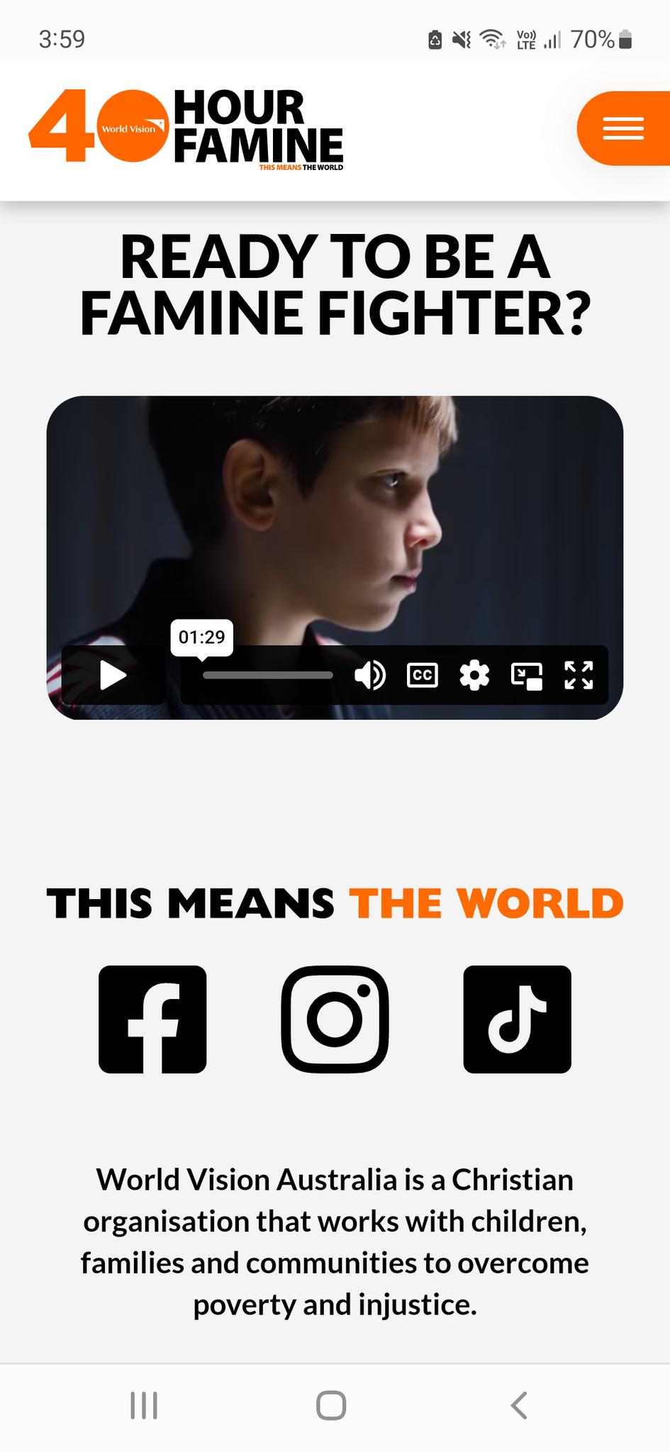
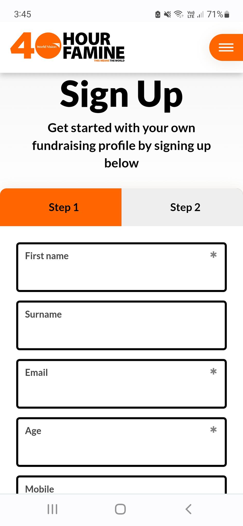
We made the sign-up process simple (Step 1 and Step 2) and pre-filled challenge boxes to make it easier for them to complete their profiles. On the Home page, we kept instructions simple and included a fun video to inspire people to join.
Results:
Participants doubled from 754 (in the previous year) to 1676 (in the current year).
Donation revenue also increased by more than 50% from $180k to $415k
 Filters & Sorting
